http://www.buildingiphoneapps.com/2011/05/exclusive-app-cooker-to-become-best.htmlexcerpt:
Creating mockups Having an idea is nice but execution is the next step. This is where the mockup part of App Cooker comes into play. Having played with Blueprint for a while (a competitor to App Cooker), I must say App Cooker design in this area really shine. The mockup area contains a tool palette called the transformation bar located at the top where you can group, arrange, mirror, rotate resize or move selected objets. This palette can be hidden to make more room for the design area which is nice.  |
| The transformation bar |
At the bottom, the property bar allows you to act upon selected objects.  |
| Property bar while a Navigation bar is selected |
 |
| Property bar while a text box is selected |
Each objects can be placed on the design canvas with great flexibility and precision. Tapping Size or Position on the transformation bar, you'll get a popover to change the attributes in a precise way with the use of the plus or minus. But, even cooler, tapping the number will extend the popover to show a keypad.
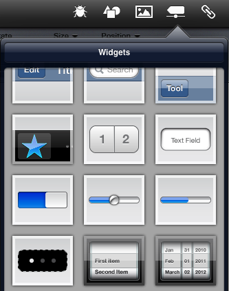
Creating mockups is done by selecting basic user interface elements (widgets) from a popover at the top right of the screen. You'll be able to use nearly all of the available native widget that Apple provides on an iOS device but a few are missing in this initial release: UITableView, SplitViewControllers, UIActionSheets, PopOvers and UIAlerts. These will be implemented in the coming releases.
 |
| Some of the supported widgets |
Also included are many graphical primitives as shown in the the following popover.
App Cooker supports portrait and landscape orientations in design and preview mode which is very useful to build complete prototypes. In edit mode, both orientations are shown one the same canvas so you don't have to go back and forth while editing both orientations. In preview mode, rotating the device will show the respective screen.
 |
| Screens supporting portrait and landscape mode |
The prototype flow is created by linking screens together with the use of hotspots . These can be shown or hidden while in preview mode to guide the user where to tap the screen. Once a mockup is done, it can be tested in preview mode where you'll be able to "run" the application. To exit the preview mode, a tap with three fingers is required.
 |
| A rather complex prototype navigation overview |
Posted via email from Pete's posterous


No comments:
Post a Comment