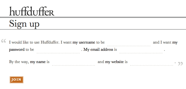
A while ago, I came across a unique registration form built by Jeremy Keith for his audio sharing site, Huffduffer. Though it asked people the same questions found in typical sign-up forms, the Huffduffer registration form did so in a narrative format. It presented input fields to people as blanks within sentences (Mad Libs-style, if you will).

Jeremy built the form to work as you'd expect. You can tab between the "blanks" just the way you tab between standard Web form input fields. You can click on any "blank" to start entering text. The password "blank" masks any characters you enter just like a standard password input, and the whole form manages errors if you answer any questions incorrectly. In other words, it works like a standard Web form but it looks quite different. The presentation is inviting and fun, which is quite unlike a standard Web form.
After seeing the Huffduffer form in action, I was curious how it would perform against a traditional form. Would people be more inclined to complete it because of the narrative format? Or would the unfamiliar presentation format confuse people? Thanks to Ron Kurti and the team at Vast.com, I now have some early answers.
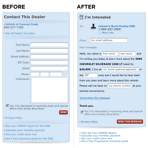
Ron and his team ran some A/B testing online that compared a traditional Web form layout with a narrative "Mad Libs" format. In Vast.com's testing, Mad Libs style forms increased conversion across the board by 25-40%. You can see a before and after view of the Contact Dealer forms where they ran these tests below.


No comments:
Post a Comment